
Before
Users add little information about their goal with no customization;
Principles of scale and visual hierarchy are not utilized
THIS TIME, I AM
Merging saving goals with banking for increased efficiency
The "Why?"
My friends struggled to link their savings goals with their banking, inspiring me to create a solution
How I can help
Creating an application that combines saving goals with banking to address the inconvenience of these features being separated
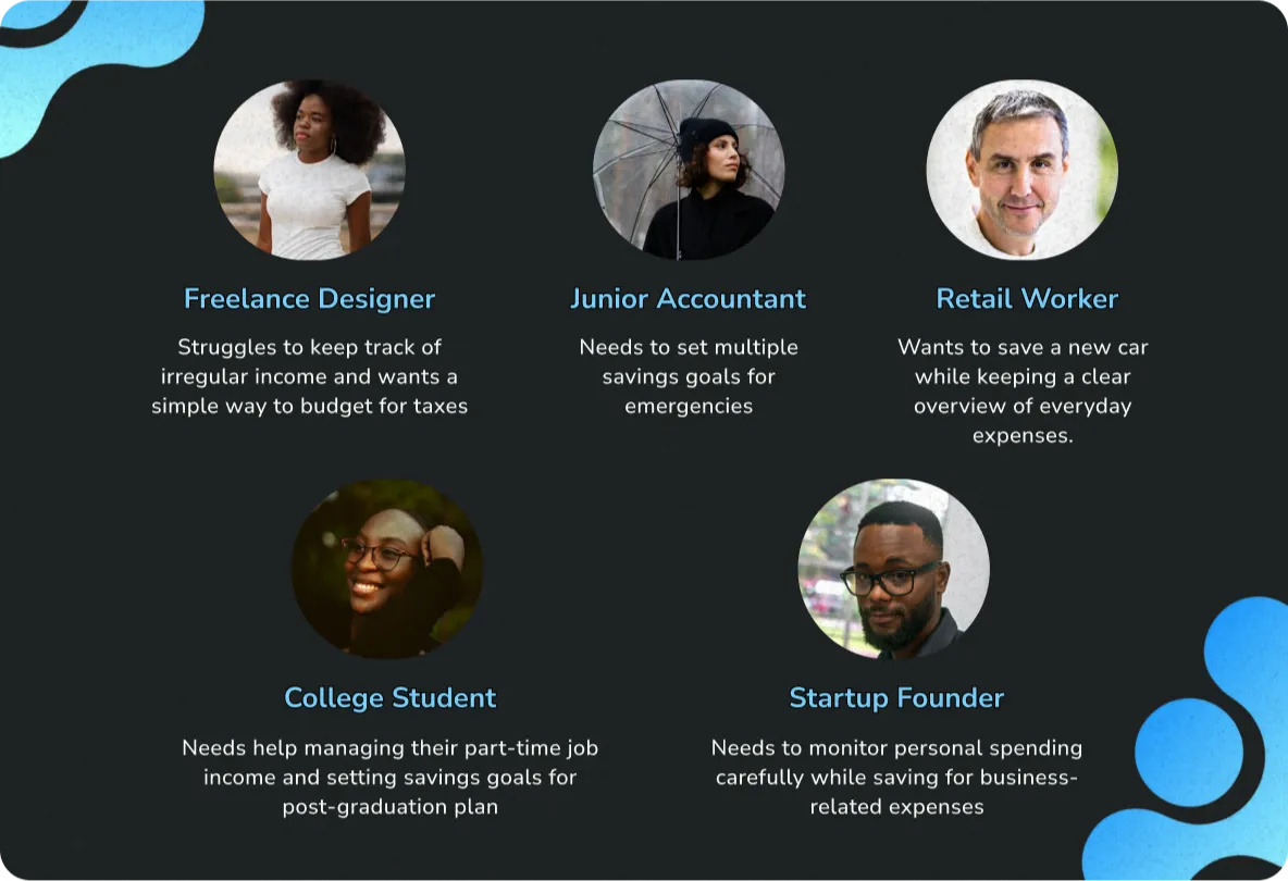
Who could main users be?
To start, a personas sheet was made to represent potential app users, focusing on their challenges. My personas include people of all lifestyles and jobs, each with unique frustrations.
The key finding is that users, regardless of occupation, need a simple way to track income and set clear savings goals based on their financial situations.
Gathered insights will help me decide on general users` pain points, not limiting the pool to a specific occupation or lifestyle
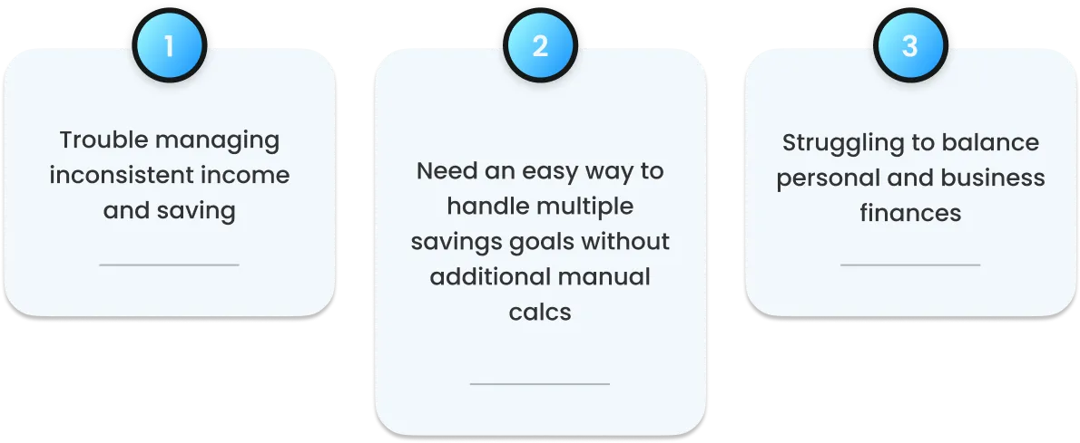
Pain points revealed
I picked out 3 key pain points from my user profiles to guide the design process.
Understanding general pains of the users is the key to creating user-centered design, and by forming them in the early stages I ensure that Ideation stage is based around solving real users` issues.
Pain points allow to create targeted solutions and will become a foundation for my design decisions, ensuring that the app is practical and useful
“Crazy 8” Exercise
To start ideation off strong and armed, I used rapid ideation technique 'Crazy 8' to brainstorm potential designs for the home screen wireframes.
The goal was to generate a range of ideas quickly and to lay out anything I can imagine as a home screen for the application. This encouraged creativity and helped me break free from conventional thinking.
By marking potential designs that had parts I liked, I can mix and match the parts during final wireframe ideations.
Wireframe iterations and early changes
During the testing of the initial wireframes, some areas kept catching my eye and making me think if they could take some improvement. Being able to iterate on design`s bases this early without losing time or investment is the best thing about wireframes, as mentioned before.
With fair use of design knowledge I was able to enhance wireframes, refining the layout for better clarity and ease of general use.
The changes improved functionality and ensured a smoother user experience
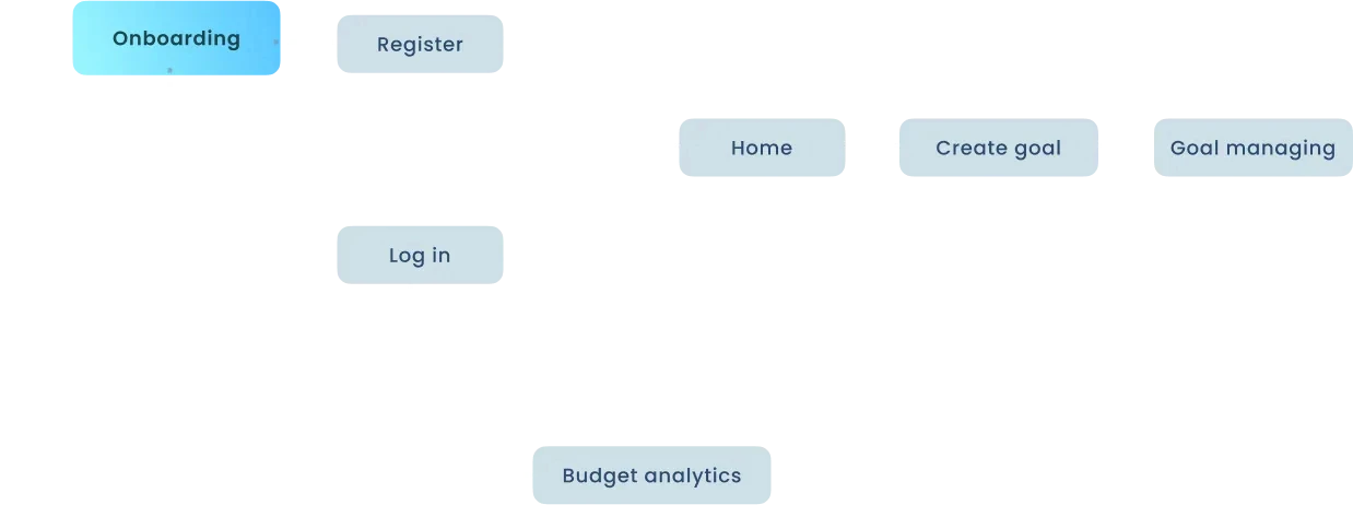
User Flow
The user flow maps out the steps users will take to accomplish their goals within the app. It`s the easiest way to visualize users journey towards the end goal of setting up and managing a saving goal.
I also added “Budget analytics” step for existing users, as the application is a mix of banking and saving goals managing, existing users will have basic banking functions available.
With user flow, I am sure that the app’s structure makes it easier for users to manage their budgeting and savings goals.
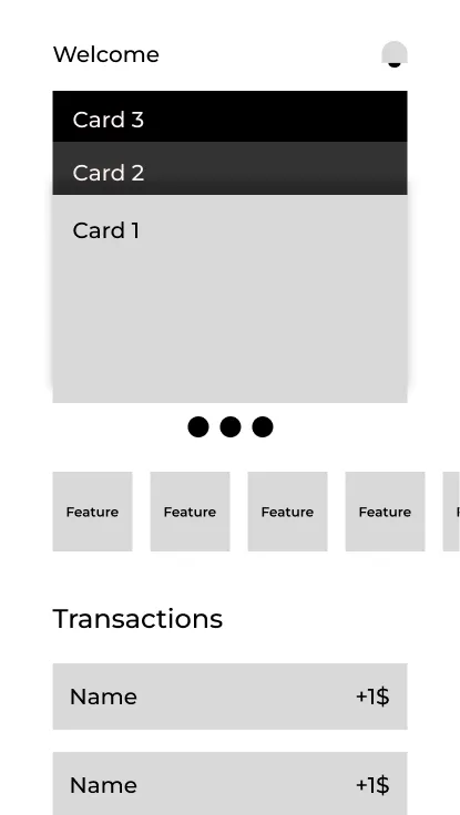
Low fidelity cascade
After the ideation phase, I moved on to low-fidelity wireframes to quickly visualize and organize the app’s layout. Quickly mapping out the app's structure and layout, i focus on creating the image of the core functionality without worrying about detailed visuals.
Wireframes are crucial for the final design, as they serve as a blueprint for high fidelity visuals and are easy to iterate changes in.
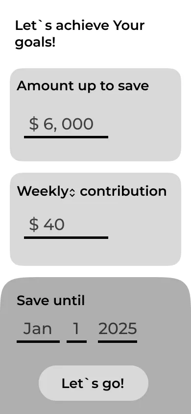
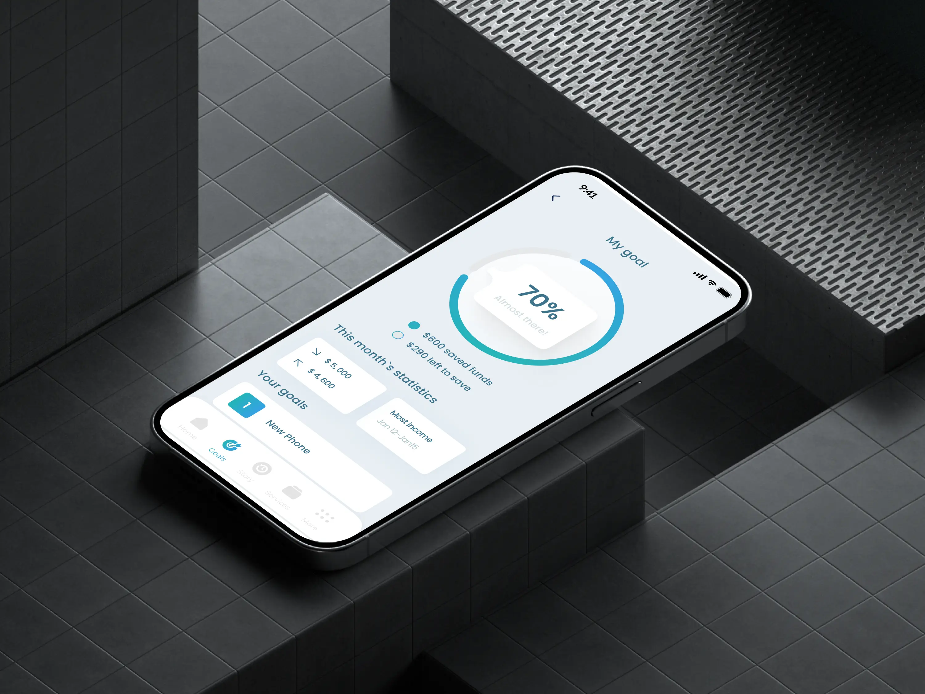
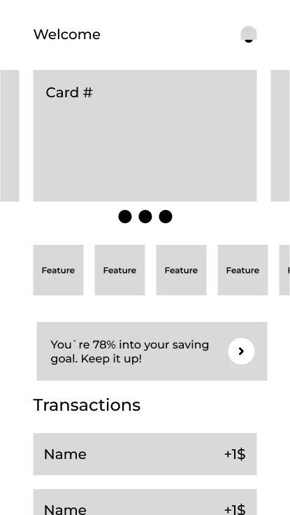
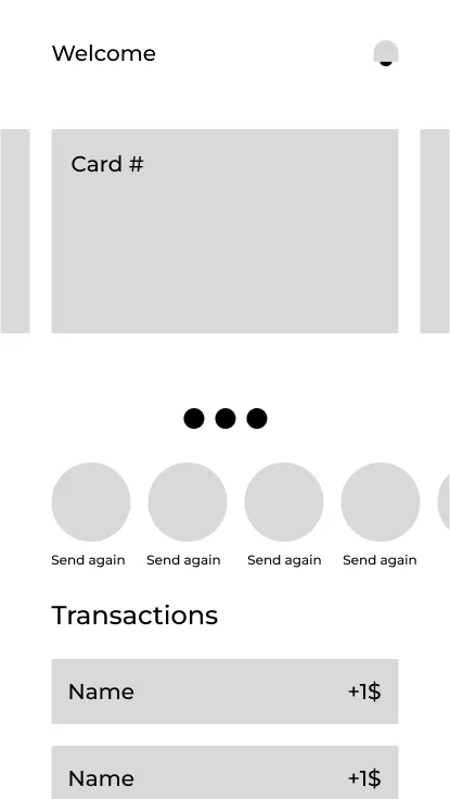
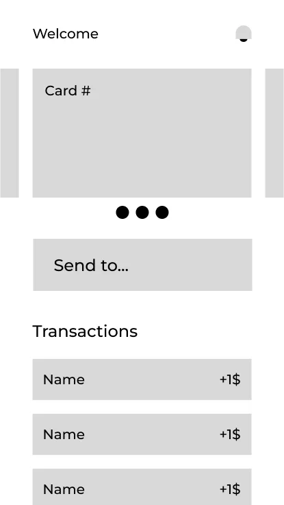
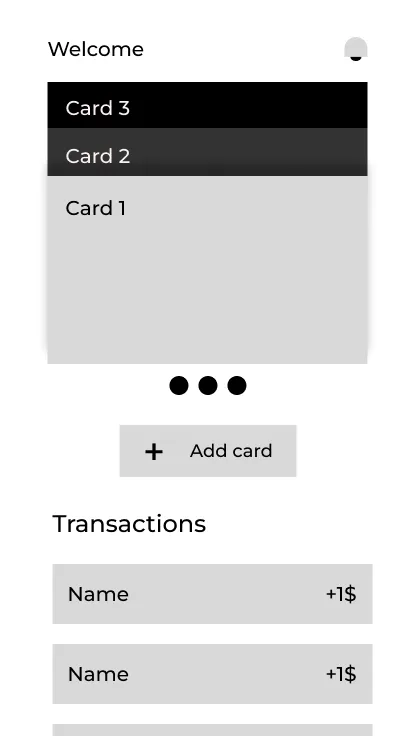
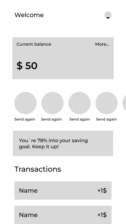
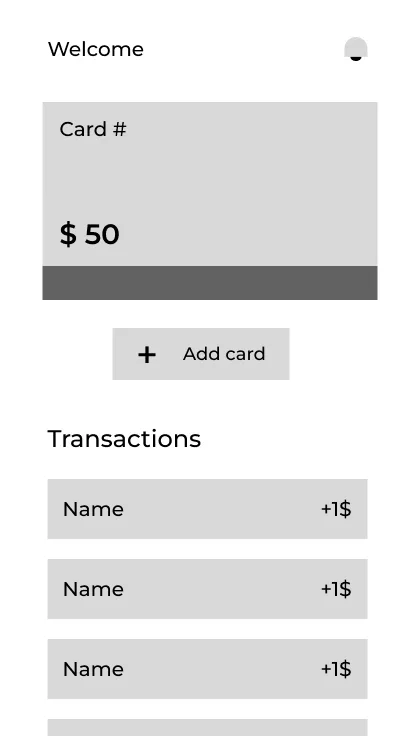
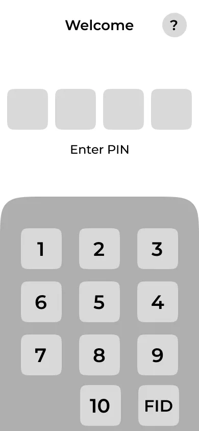
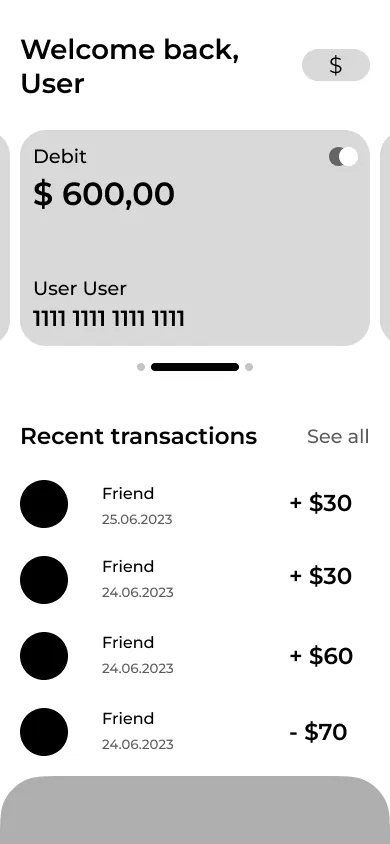
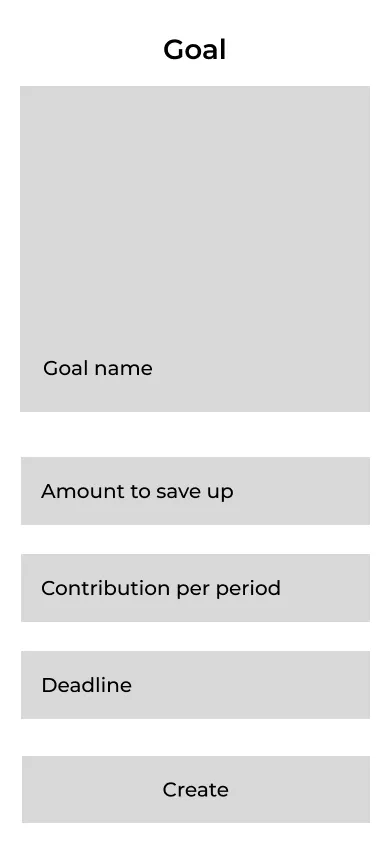
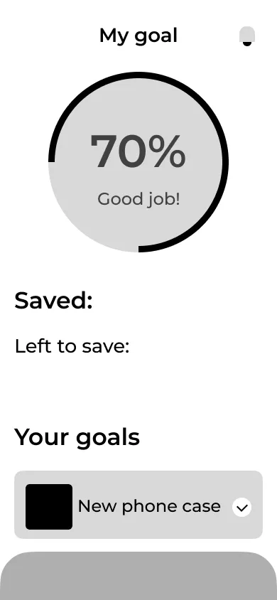
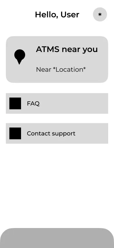
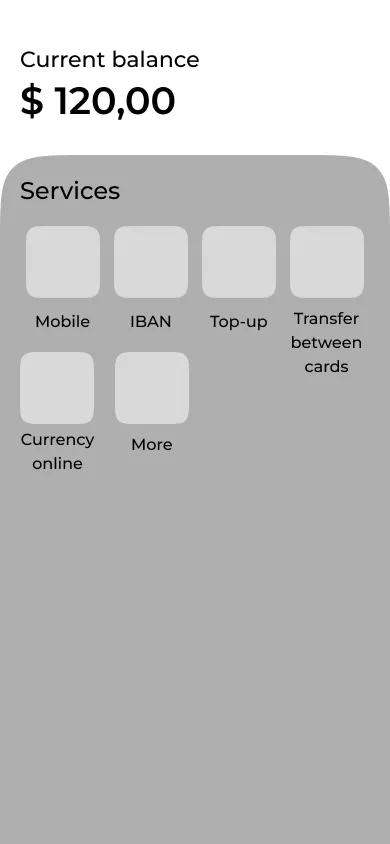
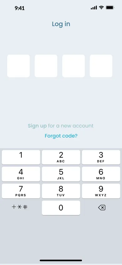
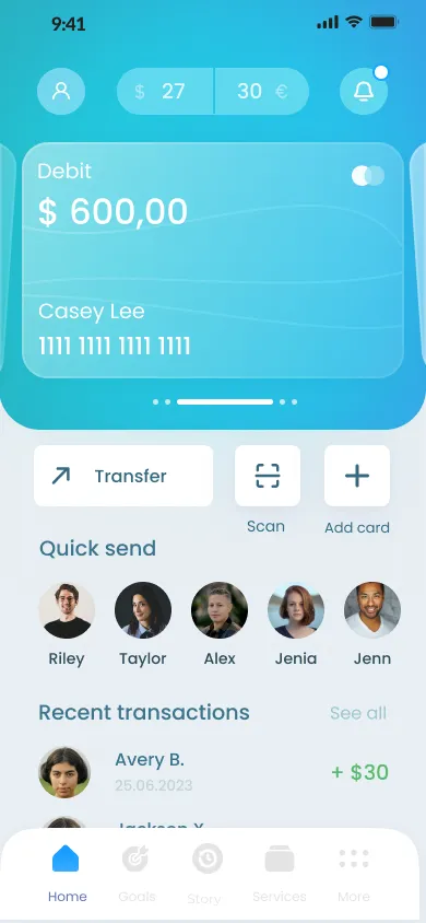
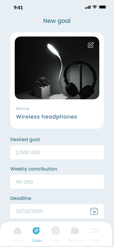
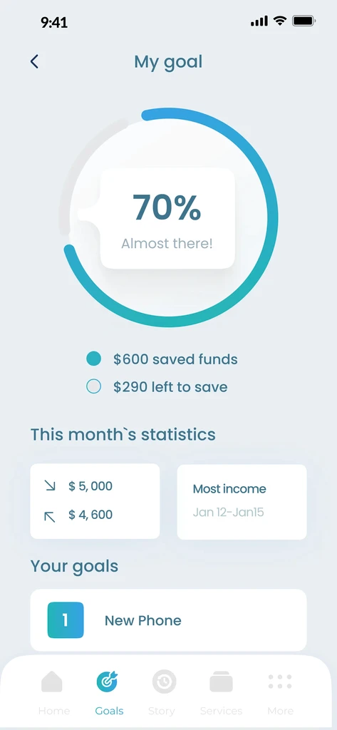
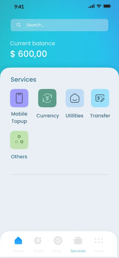
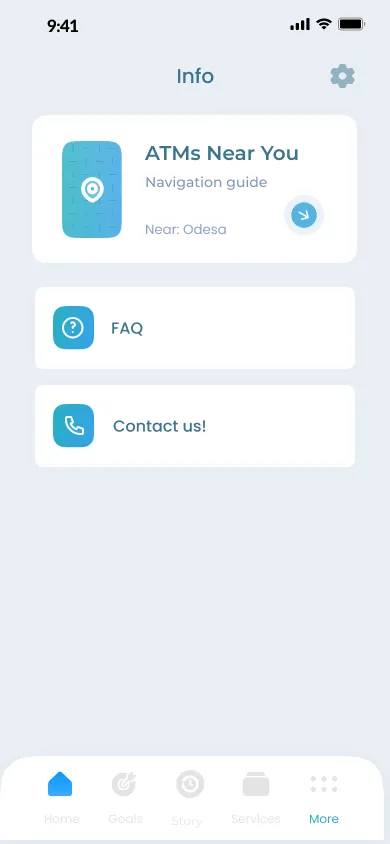
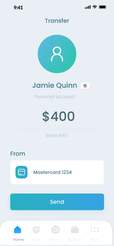
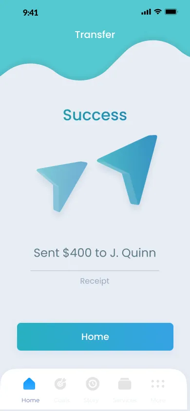
High Fidelity designs
Finally, I present the high-fidelity designs that bring the wireframes to life with color, typography, and detailed elements. Each screen serves the user with a function that fulfills either the banking and budgeting aspect, or goal creation and management aspect.
In the end, application is a concise mix of budgeting and saving, solving users` issue of separated features and headache of budgeting on your own when trying to keep up with a saving goal
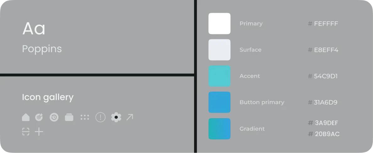
Visual style
I put together a visual style guide to keep the design consistent and match the app’s overall identity
A wrap-up
Working on this case was both fun and fruitful, giving me crucial experience.
The biggest takeaway is certainly the importance of being flexible during the ideation phase and taking full advantage of low fidelity wireframes` durability. If not for the early changes, mistakes made in first versions of the wireframes could`ve become a much bigger issue.
Overall, I was able to solve the issue introduced in the beginning by designing an application that serves users all the functionality needed for comfortable and in-one-place saving goal management together with banking features
Previous case study
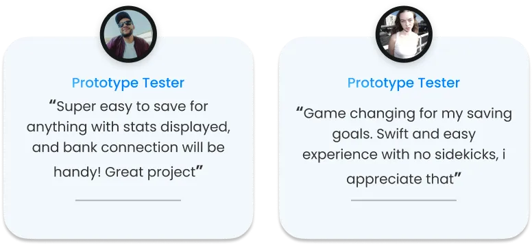
Tester ` s reviews
Real feedback from my prototype testers - see what they loved!
My role
UX Design
UI Design
User Research
Year
2024
What`s made
Mobile application
Year
2024
Project type
Solo project
Year
2024
Year
2024